Tag Archives: tool

Have you heard of the relationship mapping work group?

I have to admit I hadn’t heard of it ’til just the other day.  Thank goodness for the internet!


OK, so here’s the scoop.  Hosted by the Prospect Research Institute and moderated by the brilliant Jen Filla, this is a quarterly online meeting of practitioners who discuss relationship mapping products and methods of applying the products.


And it’s free for participants.  Yes that’s exactly what I thought too.  Count me in.


All you have to do is sign up on the Prospect Research Institute’s email list for this event and then RSVP when they send out the next invitation.  The work group accepts only the first 25 RSVPs.

Click on the logo above to sign up and take part!

signature2

Leave a comment

Filed under Uncategorized

Bookmark this – How America Gives {Interactive}

More of us are tracking constituent and donor densities by state and city in an attempt to better understand concentrations of opportunity, and that’s smart business.


But there’s another side to the coin too, what about pockets of human behavior outside of our data bases?  Shouldn’t we maintain some awareness of that too?


Yes, we should!  That’s why The Chronicle of Philanthropy publishes “How America Gives.”  And now it’s online too!  At a glance it’s easy to see pockets of population densities where Americans have higher (or lower) than average charitable giving patterns.

howamericagives


Drilling into the populations to learn more is simple and the color coding makes it easy to quickly view the cities or counties with the highest giving densities (hovering does the trick).

Click on the image to add this valuable tool to your bookmark inventory!

signature2

Leave a comment

Filed under Uncategorized

How to use VLOOKUP in Excel

One of the most useful features in Excel that you should be using, and here’s why.


Let’s say that there are 2 great reports that you can get from you donor data base.  The first report lists constituents by giving capacity and city.  The 2nd report lists donors by lifetime giving history.  Let’s say you want to put the reports together to be able to have giving history and giving capacity.  If you have an unique ID, VLOOKUP makes it easy!


In my example, the syntax is

=VLOOKUP(Sheet1!A1,Sheet2!A1:B5,2,false)

and here’s what that means — there are 4 parts to the formula:

part 1: use constituentID located in cell A1 in my current sheet as the reference

part 2: look into a range of columns/ rows in another sheet that also includes the ID

part 3: return the value to import from the 2nd column in the other sheet

part 4: default to false and make sure both sheets are sorted.


Try it yourself and you’ll figure it out in just a few minutes and feel awesome for the rest of the day!

signature2


Leave a comment

Filed under Uncategorized

How to research giving capacity

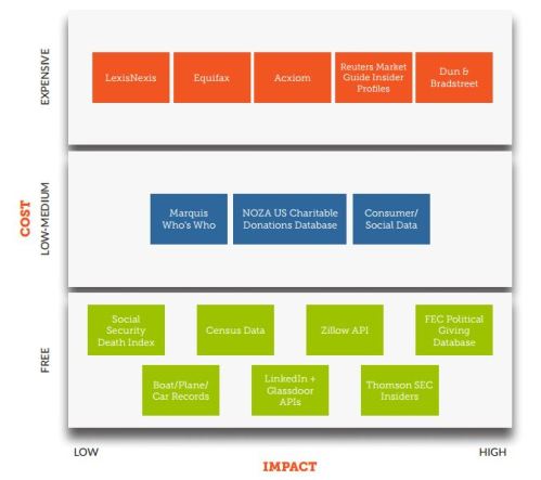
Recently I stumbled upon this great whitepaper from the awesome folks at QuadWrangle that covers a lot of basic how-to information for assessing giving capacity.  And one of the best parts about the white paper is they take a low cost point of view.

Here’s what I mean–

quadwrangle

This is a great breakdown of go-to resources for any prospect research team member.


I have to admit I did not happen to agree with the author’s mention of social affinity and consumer marketing data as a valuable resource for wealth computation.  But this is an equal opportunity forum, so if my opinion is way off base, just tell me why you disagree.


To download the white paper click on the image above.

signature2

Leave a comment

Filed under Uncategorized

Bookmark this — infographic resources

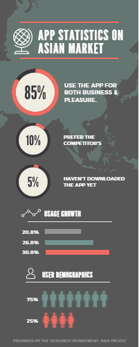
All of us have a lot of information to share with each other and we’re finding that after someone understands a concept, a question is likely to follow.  So we’re learning to assemble clusters of related information that gives a broad picture of a single subject area.  Infographics are the go-to resource to fulfill this need.


If you’ve been reading this blog for a while, you know that I’m a huge fan of Canva.com.  And just recently they introduced some free infographic templates in their suite of layouts.

infogr_template


Now, let’s just say up front that the templates they offer are purely for illustration, this isn’t a chart building tool. B ut the way Canva works is you can build your chart in the tool of your choice then import the image into the layout. See?


Here’s a good reference article from the Canva blog to get started building infographics.  If you want to compare notes, give me a call!  I’m still a novice but have been attempting to improve my designs for a while now and am always willing to trade tips for successful infographics!


signature2

Leave a comment

Filed under Uncategorized

Plan ahead – Giving Day

If your organization has a Giving Day on the horizon, placing this event in the calendar early and thorough communication and coordination planning is crucial for success.


Here are some excellent resources to assist with planning efforts–

Give Local America’s toolkit and training resources

The Knight Foundation’s giving day playbook

Capterra’s Instagram tutorial


If you have a Giving Day success story you’d like to share, let me know!

signature2


Leave a comment

Filed under Uncategorized

Bookmark this – app for wrangling brainstorming meetings

Have you ever been in a meeting that solicited ideas from all the participants – collecting the ideas on colorful post-it notes all around the room?  I was in one of those a few weeks ago.  Keeping the information organized and accessible to all the participants afterwards used to be really challenging.  But now there are smart-phone apps that help facilitate this work.  Here’s one–


Post-it Plus lets you organize ideas into groups, and allows all participants (even across multiple meetings in different locations) to contribute to the discussion of prioritizing, aligning and tackling those ideas. The app is free, just click on the image above to learn more.

signature2

Leave a comment

Filed under Uncategorized

How to make an incredible area chart

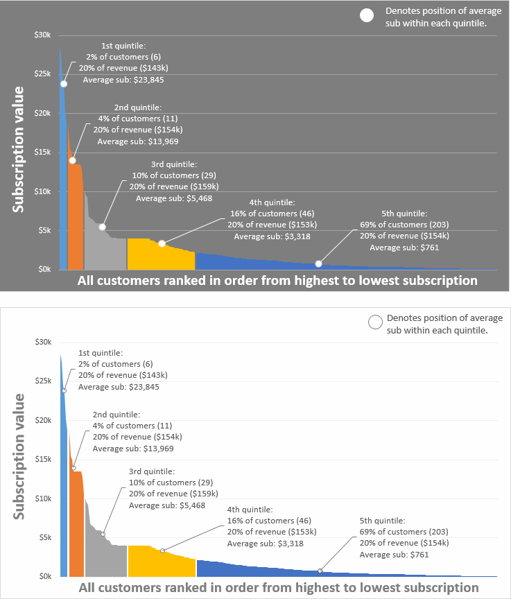
Courtesy of Chandoo.org, let’s all ramp up our area chart effectiveness in Excel.  Area charts can give an ordinary line chart more visual impact, and with these techniques, the charts can become even more information rich, leading to greater insights.  After all, isn’t that the key to a good data visualization?


First you examine and analyze your data to determine where to create your segments.  Then format it this way in Excel to generate your area chart.


Click on either of the images above to read Chandoo’s discussion.  He even gives us a preformatted sample that we can practice with.  To get the sample click here.

signature2


Leave a comment

Filed under Uncategorized

Case study: Analytics ROI at Michigan State University

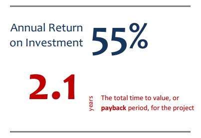
I received an invitation from TechTarget to read a white paper the other day and the topic drew me in right away.  Text mining, predictive analytics, higher education development, affinity scoring and ROI.

MSU_ROI

The project that MSU started in 2012 involved reducing the time cycle to deliver constituent insights to the major gift and annual giving fundraising teams.  They implemented more rigor around their processes for conducting text analysis and leveraging these insights for predictive analytics.  Now they compute affinity scores each night and push the results to a business intelligence (dashboard) platform that their fundraising colleagues use to select and segment constituents for next-step engagement strategies.

Seriously?  How awesome does that sound!

Click on the ROI figure above to read the white paper.


signature2

Leave a comment

Filed under Uncategorized

Bookmark this – Geomancer

Introducing Geomancer – a free and easy way to append publicly available demographic information to your excel spreadsheet by matching to your City, State or Zipcode columns.


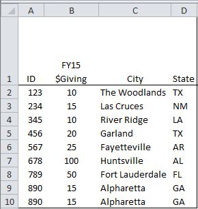
Seriously, in less than 1 minute I went from this (very generic test file)

geomancer_before

to this enhanced file – I chose the 3 appended columns from the options available based on City & State in my original sheet.

geomancer_after


Just to be sure, I tried it again with zipcode matching.  Here’s the before–

geomancer_before2

and the after!

geomancer_after2


Seriously, 1 minute.  Easy and free.  What’s not to love?

signature2


Leave a comment

Filed under Uncategorized